In the self storage industry, most customers now book online. In the US, more than 70% of storage customers start their search this way.
With so many people researching online, your website is critical to converting prospects into paying customers.
A modern storage website needs to do three things well:
- Build trust with new customers.
- Answer the questions about safety, access, size, and pricing.
- Make it simple to book a unit online.
Good self storage website design does all three without making visitors hunt for information.
In this guide, we explain how to design a website that meets modern customer expectations. We also show how Stora makes it easier by giving you a fast, well-designed storefront explicitly built for self storage, so you only need to focus on strong content and clear messaging.
| 🧠 Want to learn more? Check out our article on website design mistakes to avoid**.** |
|---|
What Great Self Storage Website Design Needs to Achieve
In the intro we mentioned three important aspects of self storage web design: building trust, answering questions, and making booking simple.
Here’s what we mean by those.
-
Building trust: Renters decide in seconds whether a website looks professional, modern and safe. A clean layout, clear branding and real photos all help create that confidence.
-
Answering questions: Potential customers want to know the basics of what you offer without having to make a phone call. That includes the unit sizes you offer, the facility’s security, the cost, and what move-ins look like. Clear copy, simple navigation and concise explanations make this easier.
-
Make booking simple: Once a visitor is ready to book, the process should be straightforward. They should be able to choose a unit, see the price, and complete the rental online without running into extra steps.
In this article, we cover the five pillars of effective self storage website design:
- Speed and performance: Ensuring your site loads quickly on all devices.
- Visuals and trust-driven design: Using photos, video and clear branding to build confidence.
- Content and UX: Helping visitors find the information they need without friction.
- Conversion optimization: Guiding people from browsing to booking.
- Analytics and improvement: Using data to refine your site over time.
Together, these pillars create a website that not only looks good but also supports growth.
Let’s look at each of those pillars in detail, starting with speed and performance.
1. Build a Fast Foundation: Speed and Performance
Website speed shapes every customer’s first impression of your business.
If your website is fast then it will keep people engaged; if it’s slow they will lose patience and leave.
One study found that websites that load in 1 second average a 7% bounce rate, while those that load in five seconds have a 38% bounce rate. Another found a 32% increase in bounce probability for every 1-second delay.
When customers compare two or three local self storage facilities, the site that loads fastest usually wins the booking.
Google also factors speed into search rankings, which means performance affects online visibility and conversions.
Optimize images properly
Large, uncompressed images are the number one cause of slow websites.
Browsers have to load photos when the user first opens the website. If they are too large, they take longer to load, causing a delay.
There are two simple ways to fix this:
- Reduce the size of the image.
- Save it in the right format.
Resize your images
Most photos taken on a phone are far larger than you need for the web. A typical camera image might be 4,000–6,000 pixels wide. A website doesn’t need anything close to that.
Good rules of thumb are to:
-
Make the longest side of the image about 1920 pixels.
-
Aim for a file size under 500 KB.
This keeps the image looking sharp on desktop screens without slowing the page down.
Save images in a web-friendly format
There are several formats you can use:
-
JPG: This is the most common option; it offers a small file size and good quality.
-
WebP: A newer format that keeps quality high while reducing file size even further.
-
PNG: Best for graphics or logos; not ideal for large photos because the files are too big.
Research shows WebP images can reduce load time by 15% to 21% compared to older formats because the files are smaller.
Compress images before uploading
“Compression” simply means using a tool to shrink the file size while keeping the image quality good enough for the web.
Compression reduces the file size without shrinking the picture itself. The image looks the same on your site, but the file is much smaller and loads faster.
Free tools like I Love Img compress photos in a few seconds. Most people won’t notice any difference in quality, but your website will load much faster.
Minimize third-party scripts
The more code your website has, the slower it loads. Studies show JavaScript libraries can contain up to 31% superfluous code.
Live chat widgets, feedback tools, and tracking scripts can add several hundred kilobytes to your load time. Use only the scripts that support your core operations.
2. Design for Trust: Visuals, Branding and First Impressions
When someone lands on your website, they make a judgment based on what they see in the first few seconds.
Research from the Stanford Web Credibility Project found 46% of people judge a website’s credibility based on design.
This means your layout, photography and branding do a lot to build visitor trust before anyone reads a word.
How to create a professional layout
Visitors instantly check three things when they land on a page:
- Does this business look real and reliable?
- Is this a clean, modern website?
- Can I see what they offer without digging for it?
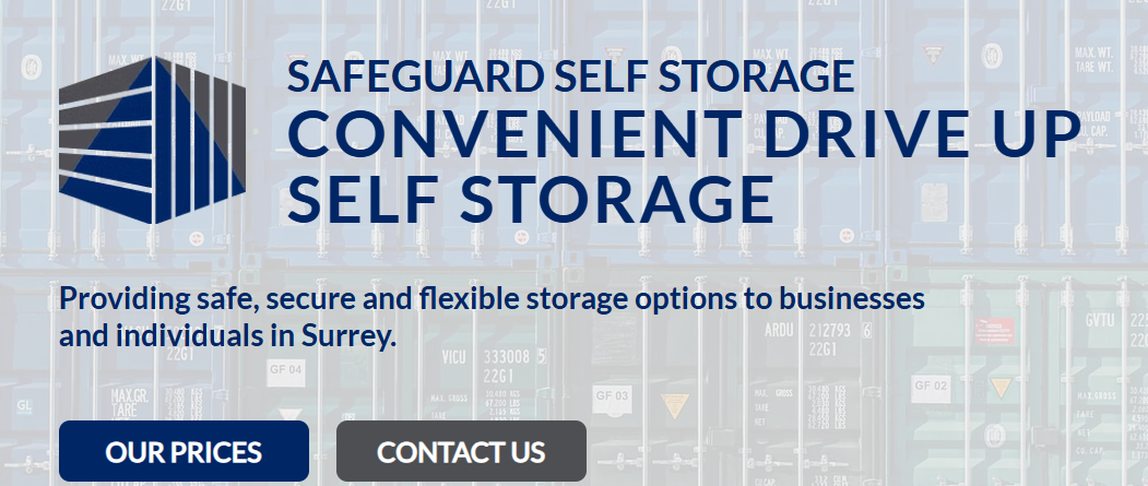
To support that, focus on your “above-the-fold” area. This is the part of the page visible before someone scrolls.
This section should include:
- A clear headline explaining what you offer.
- Your location, or the area you serve.
- A simple call to action such as “View unit prices”.
- A real photo of your storage facility.
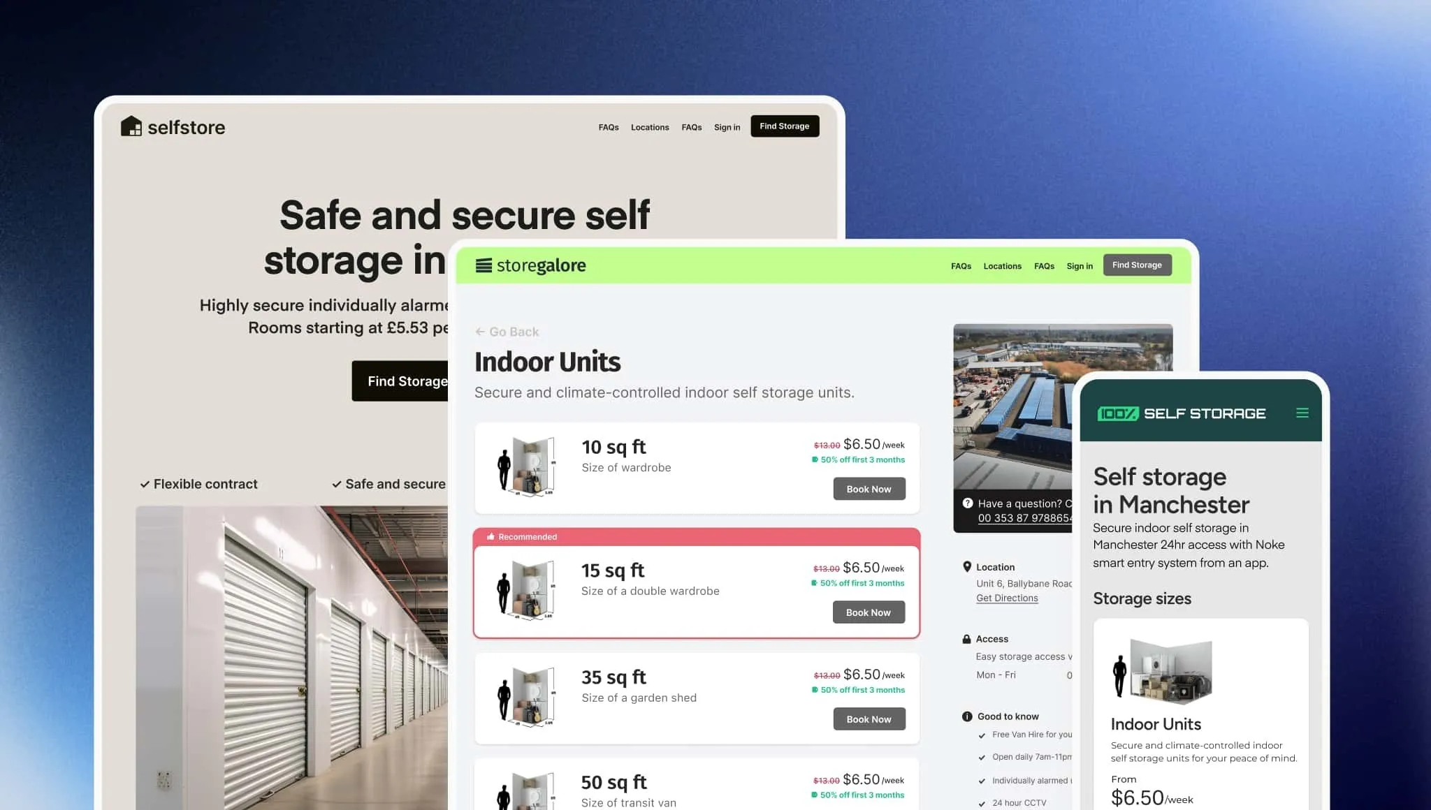
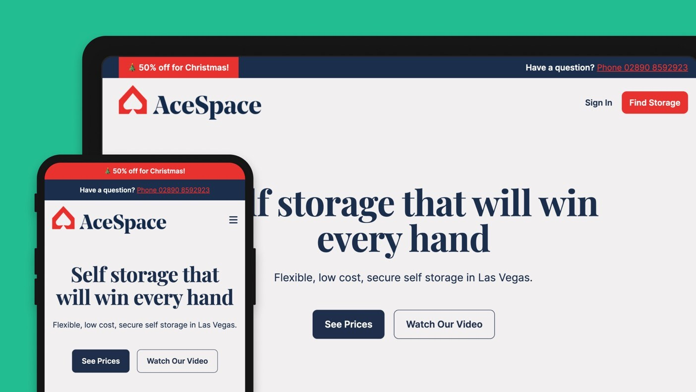
This example from Stora customer, Safeguard Self Storage, meets all four of these requirements.
Use real, high-quality photography
Real photos build trust because they show what someone will find upon arrival.
Research shows real business photos are seen as more trustworthy than stock images (https://mendelsites.com/stock-real-photos-for-your-local-business-website).
You do not need expensive equipment. A modern smartphone works well if you take photos carefully.
Aim to capture:
- The outside of your facility.
- Your front gate and fence.
- A typical unit with the door open.
- A hallway or drive-up lane.
- Your office or reception area.
- Any security features, such as cameras or keypad entry.
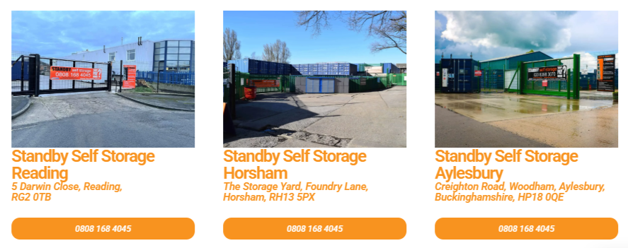
For example, this image from Stora customer Standby Self Storage shows each of its locations so customers can see they are clean and secure.
Before taking photos:
- Pick a bright, clear day.
- Remove clutter or debris.
- Wipe smudges from the camera lens.
- Hold the camera steady or use both hands.
- Take several angles and choose the best.
The ideal website will include the following images:
- A strong hero image at the top of your homepage.
- A photo gallery section further down the page.
- Individual photos for each unit size.
- Feature or amenities sections to illustrate key benefits.
Add video for extra credibility
Video helps customers understand your facility faster than text or photos alone. A simple walk-through filmed on your phone can show how easy it is to enter, drive around and access a unit.
Useful types of video include:
- A short tour showing the gate, keypad and lanes.
- A unit walkthrough showing inside a typical space.
- A staff introduction to make the business feel more personal.
Drone footage can look impressive, but it’s not essential. A steady, well-lit phone video is more than enough.
3. Help Visitors Find What They Need: UX and Content That Answers Questions
Once you’ve made a good first impression on potential customers, the next priority for your website is answering the questions they have.
People visit your website to solve a problem. The faster you help them understand whether your facility fits their needs, the more likely they are to book.
Understand what renters actually want to know
Most visitors don’t want to read a complete list of features. They care about outcomes.
Instead of focusing on “what you have”, focus on “what it does for them”.
Common questions customers ask include:
- Is this facility close to me?
- Is it safe?
- What size unit do I need?
- How much will it cost?
- How does move-in work?
- Can I access my unit easily?
- Is the process quick, or will I need to call someone?
If your website makes people hunt for answers, they will leave. One study found small businesses lose up to 38% of potential customers because of poor website clarity.
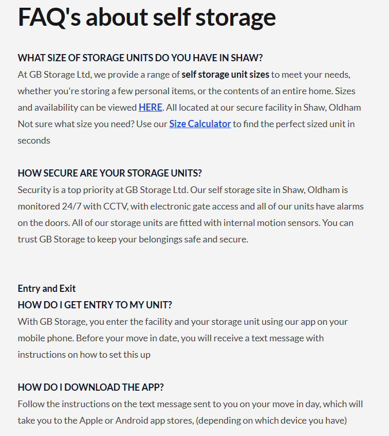
Use your homepage and main navigation to give visitors short, clear paths to the information they expect.
Stora customer GB Storage does this by providing an FAQ page answering common customer questions.
Write clear, concise, scannable content
People skim storage websites and are likely to choose a competitor website if yours is too text heavy.
Keep your writing simple and structured so that it communicates clearly in as few words as possible.
Tips for clarity:
- Use short paragraphs of one to three sentences each.
- Break up information with headings.
- Use bullet points for features and benefits.
- Avoid jargon or internal terminology.
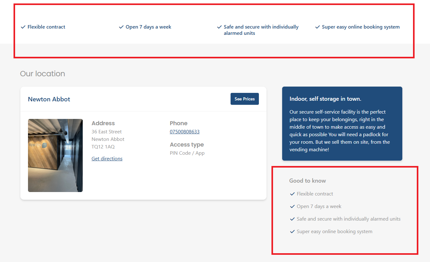
For example, Stora customer TenTen Storage uses simple checklists on its homepage that help summarize its services.
Help visitors choose the right unit
Choosing a storage unit is unfamiliar for many people, so your website should guide them.
Provide visitors with:
- A simple size guide with everyday examples (“Fits the contents of a one-bedroom apartment”).
- Clear unit descriptions that explain access, convenience and typical uses.
- Short explanations of amenities like climate control, drive-up access or extended hours.
Helping customers understand their options reduces hesitation and increases conversions.
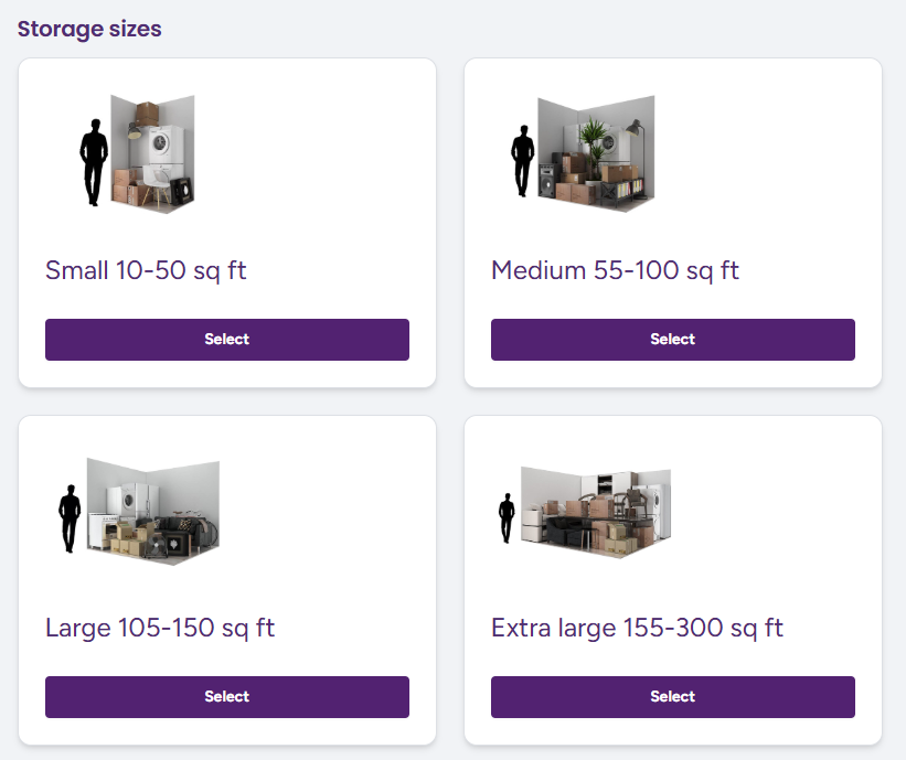
Stora customer Indoor Self Storage does this by providing simple graphics showing how many items can fit into a unit and how they compare to the height of an adult.
Make contact options clear without forcing phone calls
Customers should be able to contact you easily, without feeling pressured to call. Many people prefer digital contact, especially younger renters.
To support this, include:
- Your full address near the top of your site and in the footer.
- A clickable phone number.
- A clear email link.
- Optional WhatsApp or text message options if you use them.
Clear contact options reassure customers that they can get in touch at any time, even if they choose to book online without speaking to you.
4. Design for Conversions: Turn Browsing into Booking
Once a visitor trusts your business and understands what you offer, the next step is helping them take action.
Good conversion design removes friction and guides people toward booking a unit without confusion or hesitation. The aim is to keep the process clear, predictable and easy to follow.
This section provides some tips for achieving this.
Clear, consistent calls to action
A website needs one main call to action (CTA) that appears consistently across the site. If you use several different CTAs, such as “Book now”, “Check prices”, and “Reserve today”, you dilute their impact and make the visitor think too much about what to click.
Choose a single, simple phrase that describes the next step you want people to take. Good examples include:
- “View unit prices”.
- “Check availability”.
- “Reserve a unit”.
Once you decide on your primary CTA, place it in predictable locations. These include:
- The top-right corner of your header.
- The main hero section.
- Unit listings pages.
- The bottom of long pages.
A study on CTA placement found that contextual placement led to a 42% higher click-through rate (CTR) compared to generic placement.
Keep competing choices to a minimum. If a button doesn’t lead to a conversion step or help someone choose a unit, it likely doesn’t belong in a high-visibility area.
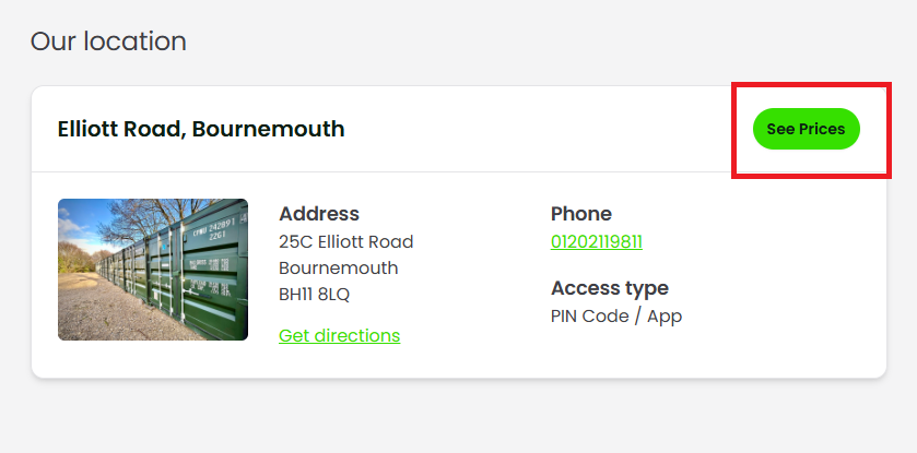
Stora customer Secured Spaces has a good approach to this. It provides hyperlinks to useful information, but CTAs related to the booking flow are highlighted as a bright green button. This ensures visibility and encourages users to click.
Make online rentals effortless
Customers expect to rent storage units online the same way they order groceries or book a hotel.
Modern renters prefer self-service: they want to handle the process quickly and without having to call.
If your booking flow is slow or complicated, they will often leave and choose a competitor whose website feels easier.
A smooth rental experience depends on reducing friction. This means:
- No forced account creation.
- No long or complex forms.
- No duplicate steps.
- No unexpected requirements (such as uploading documents before committing).
Every extra step increases abandonment rates. In broader e-commerce studies, long checkout forms are one of the top reasons customers abandon a purchase. The same applies here: keep the booking process short and predictable.
Present pricing transparently
Clear pricing builds trust and speeds up decision-making. Many renters want to know, upfront, what they will pay and which units are available.
If a website hides prices or requires a call to get a quote, customers often go elsewhere.
Real-time availability helps, because visitors can immediately see which units they can rent today.
Display the price next to each unit size, and avoid complicated fee structures. If you offer discounts, show them clearly and explain how they work.
For example, you might offer “First month half price” or “20% off your first three months”.
If you use value-based pricing, a model where units cost more or less based on factors like location within the facility, ease of access, or special features, explain it simply.
For example, you might say: “Units closer to the entrance cost slightly more due to easier access.”
This helps visitors understand why prices differ, which reduces hesitation.
Use reviews and social proof strategically
Reviews reassure visitors that others have had a good experience with your facility.
They also influence search engine optimization (SEO), because Google uses review quality and quantity as signals when ranking local businesses.
Displaying reviews can meaningfully improve conversions. One study found that showing customer reviews increased conversion rates by 34%.
Place reviews near decision points so visitors see them at the right moment. Useful placements include:
- Under your hero section.
- On unit size pages.
- Near your primary CTA.
- In a short carousel on your homepage.
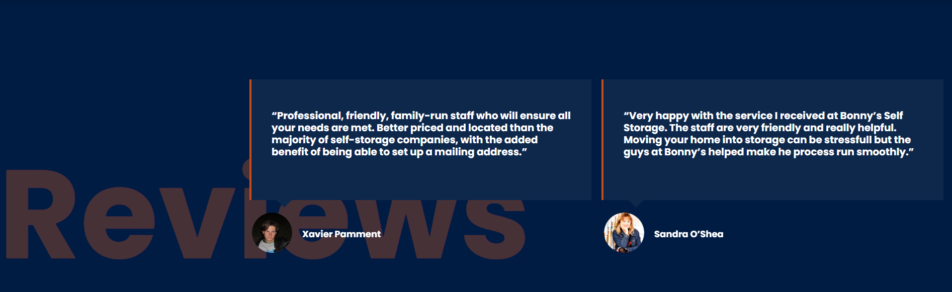
Here’s a good example of that last point from Stora customer Bonnys Self Storage. Their carousel is animated, allowing potential customers to see a range of positive reviews.
You do not need a separate “Testimonials” page; most visitors will not click it. Instead, weave reviews into core pages so they support the booking process.
If you have strong Google Reviews, embed them across your site. This adds credibility because it comes from a neutral platform customers trust.
Use Conversion Tools to Maximize Bookings
Stora includes several tools that help turn visitors into leads or bookings. These features work best when used sparingly and with clear messaging. The aim is to nudge, not overwhelm.
High-converting pop-up forms
Pop-ups, like the one shown below, can capture leads you might otherwise lose.
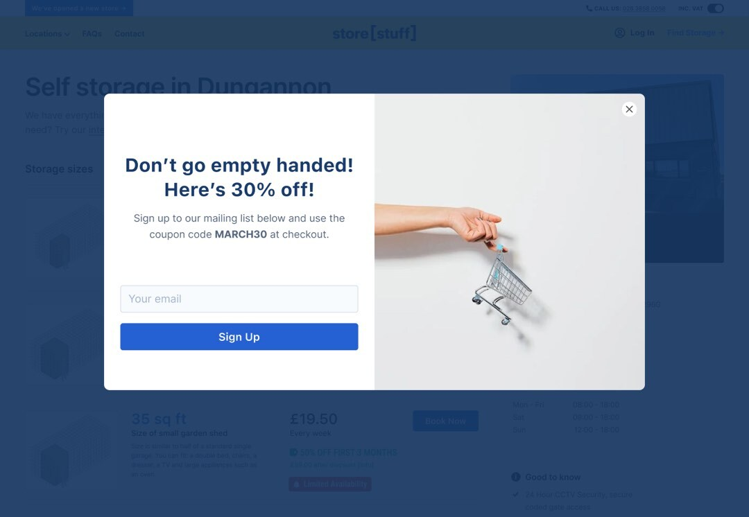
However, they need to be used carefully. There are three common triggers:
- Exit intent: appears when a visitor moves their cursor toward the back button.
- Timed: appears after a set number of seconds.
- Scroll-based: appears when someone reaches a certain point on the page.
In most cases, exit-intent pop-ups work best because they avoid interrupting people while they’re reading. Effective messages tend to offer help rather than a hard sell, such as:
- “Not sure what size you need? Ask us.”
- “Have a question before booking?”
Keep the form short. The more fields you add, the fewer people will complete it. Name, email, and a message box are usually enough.
To use pop-ups, you often need to get a third-party app and integrate it with your website. However, Stora users get this functionality built-in. Check out our pop-up ideas guide for more information.
Footer banners
Footer banners sit at the bottom of the page and are useful for re-engaging visitors who have scrolled all the way down. They work well for:
- Highlighting a discount.
- Showing a “View available units” CTA.
- Directing people to check prices.
Seasonal banners also perform well, such as promotions for student storage during summer or year-end moves in winter.
Avoid adding them to every single page if they repeat the same message. If visitors see the same banner too often, they start to ignore it.
Info bars
Info bars appear at the top of the page and are best for short, important messages such as:
- “Limited units available this week”.
- “New site now open in Springfield”.
- “Extended access hours now available”.
Use them sparingly. If the info bar is always on, visitors stop noticing it. Stick to short, relevant messages and ensure they do not visually compete with your main CTA.
Stora lets you edit pop-ups, footer banners, and info bars in just a few clicks. The key is not the tool itself, but how intentionally you use it. Each message should help a visitor move toward booking, not distract them from it.
5. Optimise with Data: SEO, Analytics and Continuous Improvement
Strong website design is only the first step. To keep improving how well your website converts visitors into renters, you need data that shows where people come from, how they move through your pages, and at what point they stop progressing.
Search tools and analytics platforms provide this information so you can make informed changes rather than guess.
Set up Google Search Console
Google Search Console shows how your site appears in Google search and where it can improve. Once you verify your domain, three areas are especially useful:
1. Fix index issues
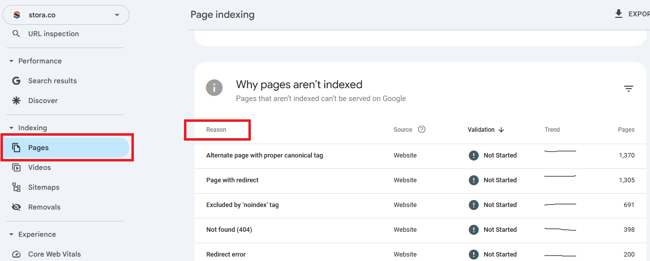
For a page to be listed in Google search results, it first needs to find it, scan it and add it to its index. However, if it has difficulties at any stage of this, then the page won’t appear in search results at all.
Search Console highlights these problems and explains what needs fixing. Go to “Pages” under the “Indexing” menu in the left sidebar and then scroll down.
You’ll see a list of errors and the reasons for them. These might include missing pages, incorrect redirects or blocked content.
2. Find keywords you already show up for
The Performance report shows the search queries that lead people to your site. Examples might include:
- Self storage near me.
- Best self storage [your town].
- Self storage [your city].
To find these, click “Search results” in the left sidebar and scroll down.
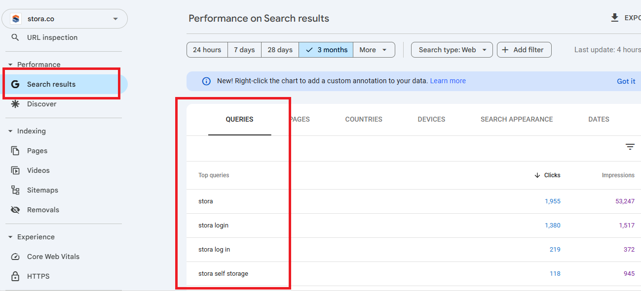
You may discover keywords you were not intentionally targeting, such as storage-related searches in nearby towns.
This helps you refine your content, add location references or build internal links to support those terms. Check out our guide to learn more about self storage SEO.
3. Improve click-through via titles and meta descriptions
If a page gets lots of impressions but only a few clicks, your title tag or meta description may not be doing their job.
- The title tag is the blue, clickable headline that appears in Google’s search results.
- The meta description is the short summary underneath it.
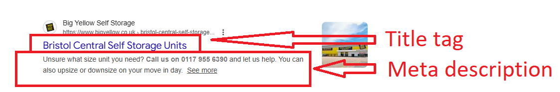
These two elements are often the first things people see before visiting your website, so they play a significant role in whether someone chooses your listing over a competitor’s.
Clear wording, a strong value statement and a location reference can all help improve your click-through rate (CTR).
Use Google Analytics to improve your website
Google Analytics shows how people interact with your site after they arrive. It helps you see where visitors engage and where they drop off.
1. Identify drop-off pages
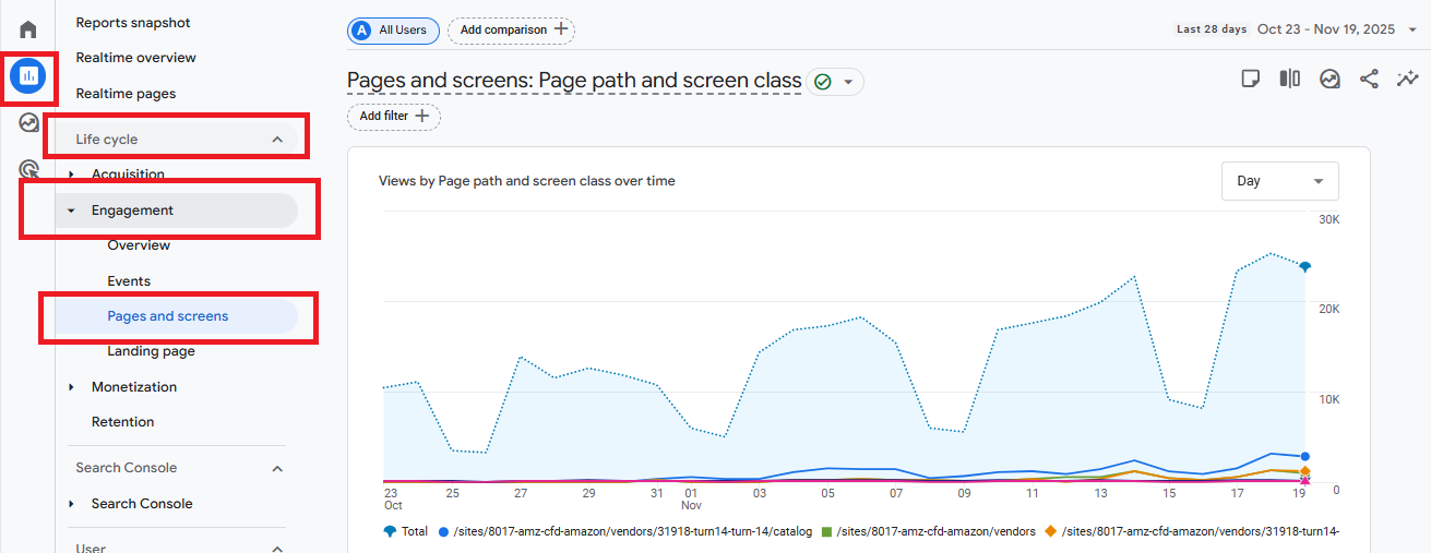
The “Pages and Screens” report shows which pages receive traffic and where people leave.
If many visitors exit from a unit size page or the booking flow, those pages may need clearer messaging or a simpler layout.
To find this go to “Report”, then “Life cycle” and choose “Engagement”.
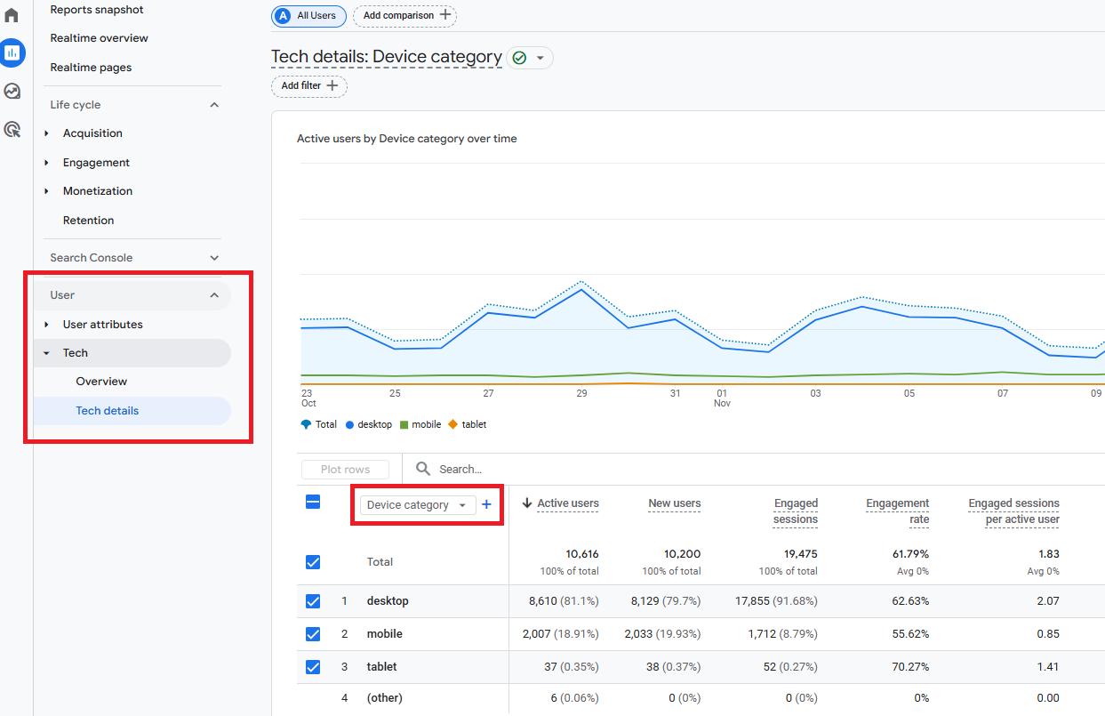
2. Device-by-device optimisation
Most storage customers browse on phones. Analytics shows performance separately for mobile devices, desktop, and tablet.
If mobile bounce rates are higher, review your design on a phone and adjust spacing, button size or image placement.
To find this, go to the “User” section of the reports menu and select “Tech”, then “Tech details”. Click the drop-down menu and choose “Device category”.
3. Test new CTAs, headlines and layouts
Simple tests can reveal what works best. Try changing one element at a time:
- A clearer headline.
- A shorter unit description.
- A more visible CTA.
- A simplified booking sequence.
Track results in Analytics to see whether engagement or bookings improve.
Leverage Stora’s performance insights
Most platforms offer analytics so you can monitor activity across your website. Stora’s are tailored to core business metrics relating to self storage. These include occupancy, revenue and lead sources.
This allows you to:
- See which unit types people view most often and compare that to actual availability.
- Review which pages lead people to make a booking.
- Understand whether visitors come from Google searches, ads, local listings or direct traffic.
Why Stora Gives You an Advantage in Self Storage Website Design
Stora is a self-storage management software platform designed to help independent operators and owners automate, run, and grow their self-storage businesses.
Generic website builders are not designed for the way self storage customers search, compare and book online.
Because Stora is specifically built for self storage operators, the fundamentals you need are already in place.
These include:
High-converting templates: Stora storefront templates follow proven design patterns that help visitors understand your offer and move quickly toward booking. Layouts are simple, consistent and built around customer behavior rather than decoration.
True online rentals: Customers can check availability, choose a unit and complete the rental on any device. The process is frictionless and works around the clock.
Automated access, payments, and confirmations: After booking, customers receive everything they need without waiting for manual follow-up. This saves time for both the operator and the renter.
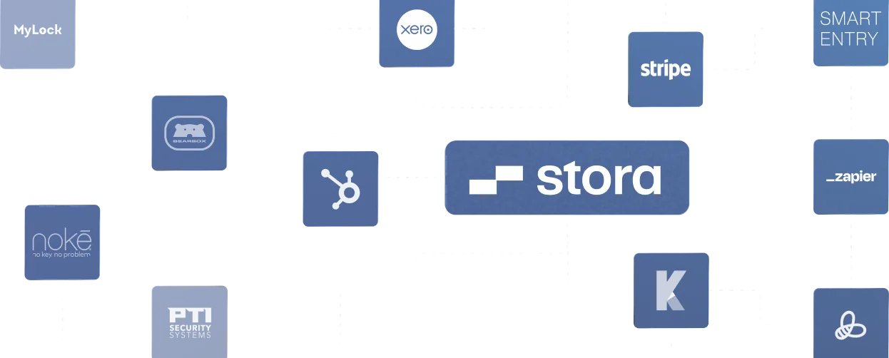
Integrations that support real operations: Stora connects with smart entry systems, ID verification tools and accounting software. These integrations remove manual admin and help you run an efficient, modern facility.
Building a Successful Self Storage Website Shouldn’t Be Technical
A great self storage website does three things well: it builds trust, it gives customers the information they need, and it makes it easy to book.
When your layout is clear, your content is simple, and your booking flow is smooth, more visitors become tenants.
None of this requires technical skills. With the right structure, good photography, and a focus on the customer journey, any operator can create a website that performs well.
Minor improvements like faster load times, better headlines, clearer pricing or updated unit descriptions often have a noticeable impact on conversions.
Stora makes the process easier by giving you a fast, purpose-built storefront and the tools to automate rentals, online payments and access.
You focus on your messaging and your customer experience, while Stora handles the rest.
If you want a website that feels modern, loads quickly and helps you grow your facility, now is a good time to take the next step.
Book a demo and see how Stora can support your business from day one.